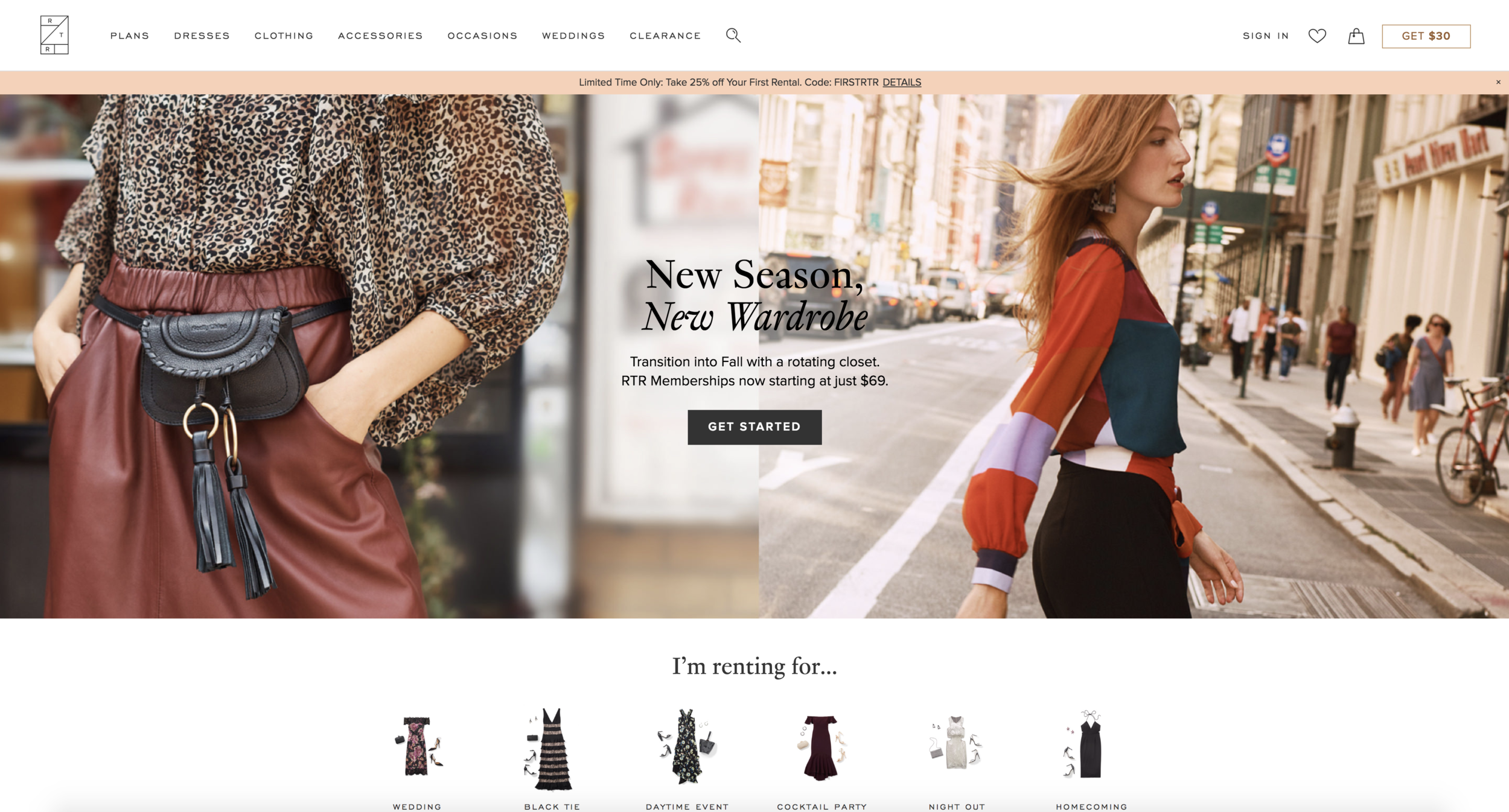
It’s been immensely rewarding shipping designs for such a unique and disruptive ecommerce offering. In one and a half years at RTR, we shipped a huge amount of my design work as part of the relaunch of RTR’s subscription offering, as well as the ongoing support of RTR’s already successful Reserve program.
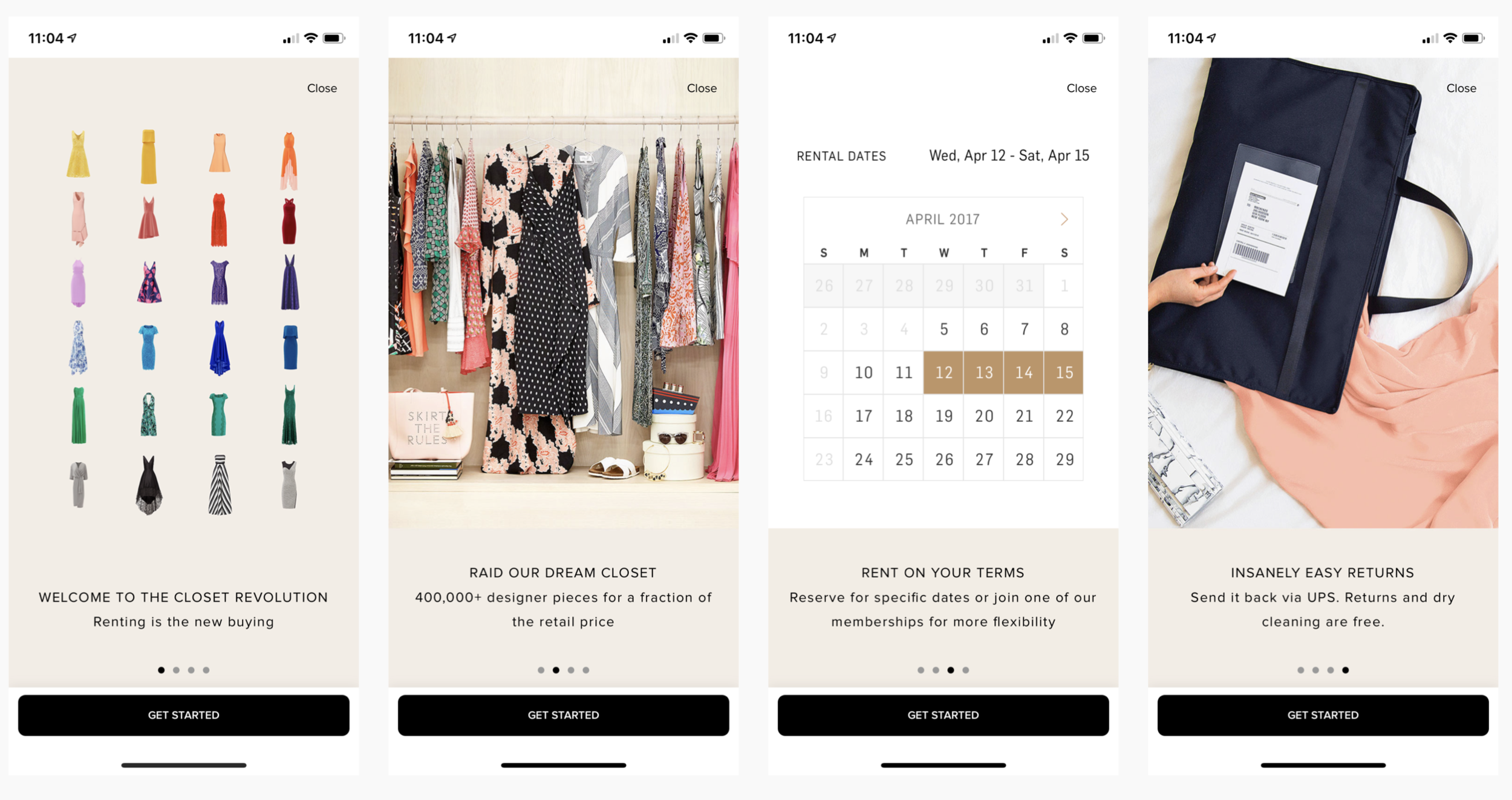
I was brought on at RTR to build out the subscription business, and a big challenge was converting all our old legacy ‘rental’ customers to a subscription.
The subscriptions were complex products with lots of rules that needed explaining, therefore a lot of time went into designing flows that were as simple and appealing as possible.
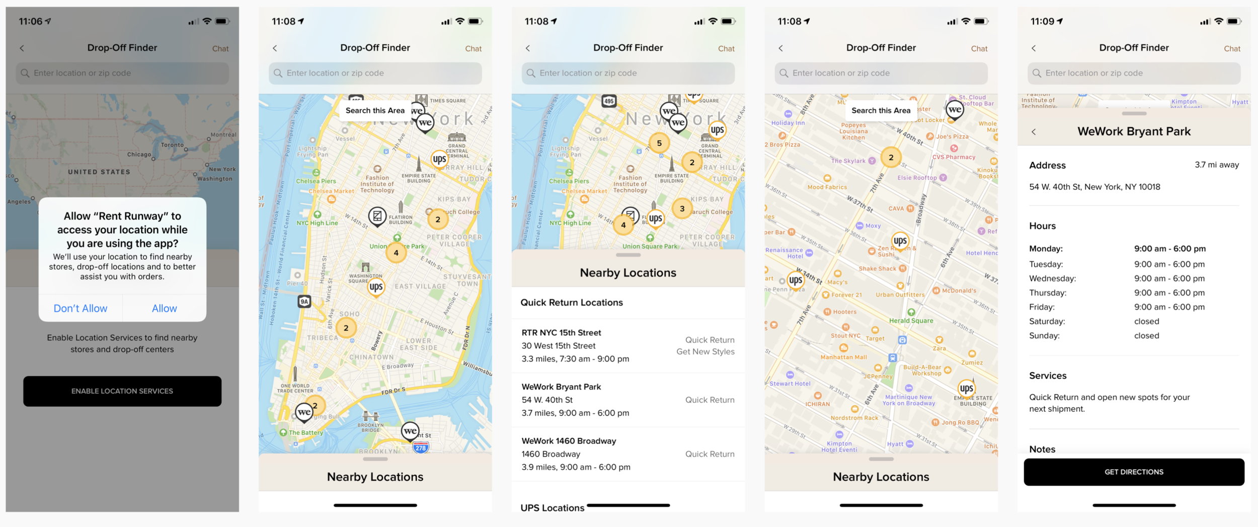
I worked on a lot of ‘special features’ in the app, that utilized newer technology is create tools we knew customers would love. Shown here is the location dropoff map, that had a lot of logic dictating suggestions to the customer on where they could drop off their clothes, where they could pick up new clothes, etc etc.
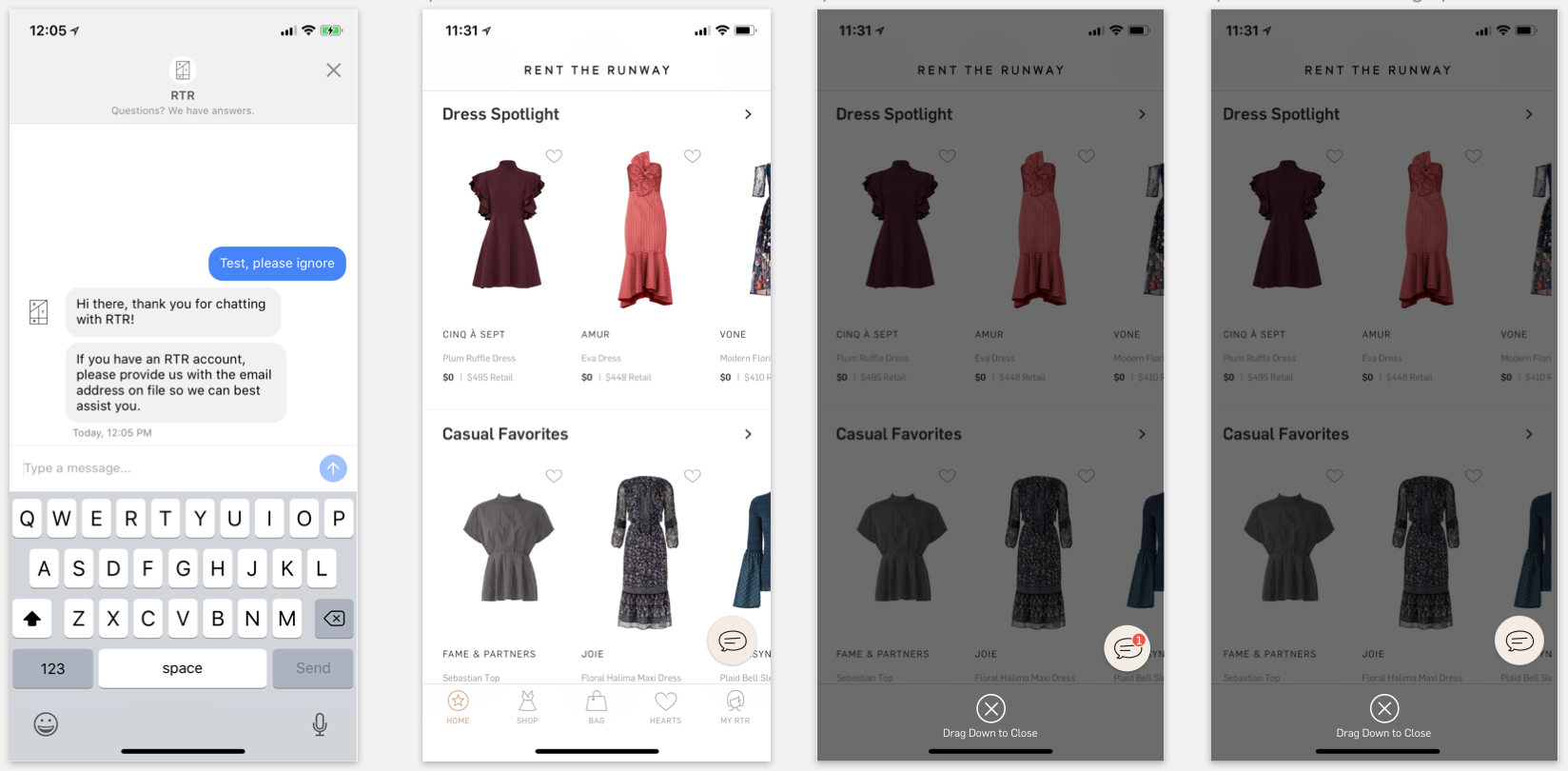
Another ‘special feature’ was the chatbot, that we designed to be as ‘Apple’ as possible within our app.
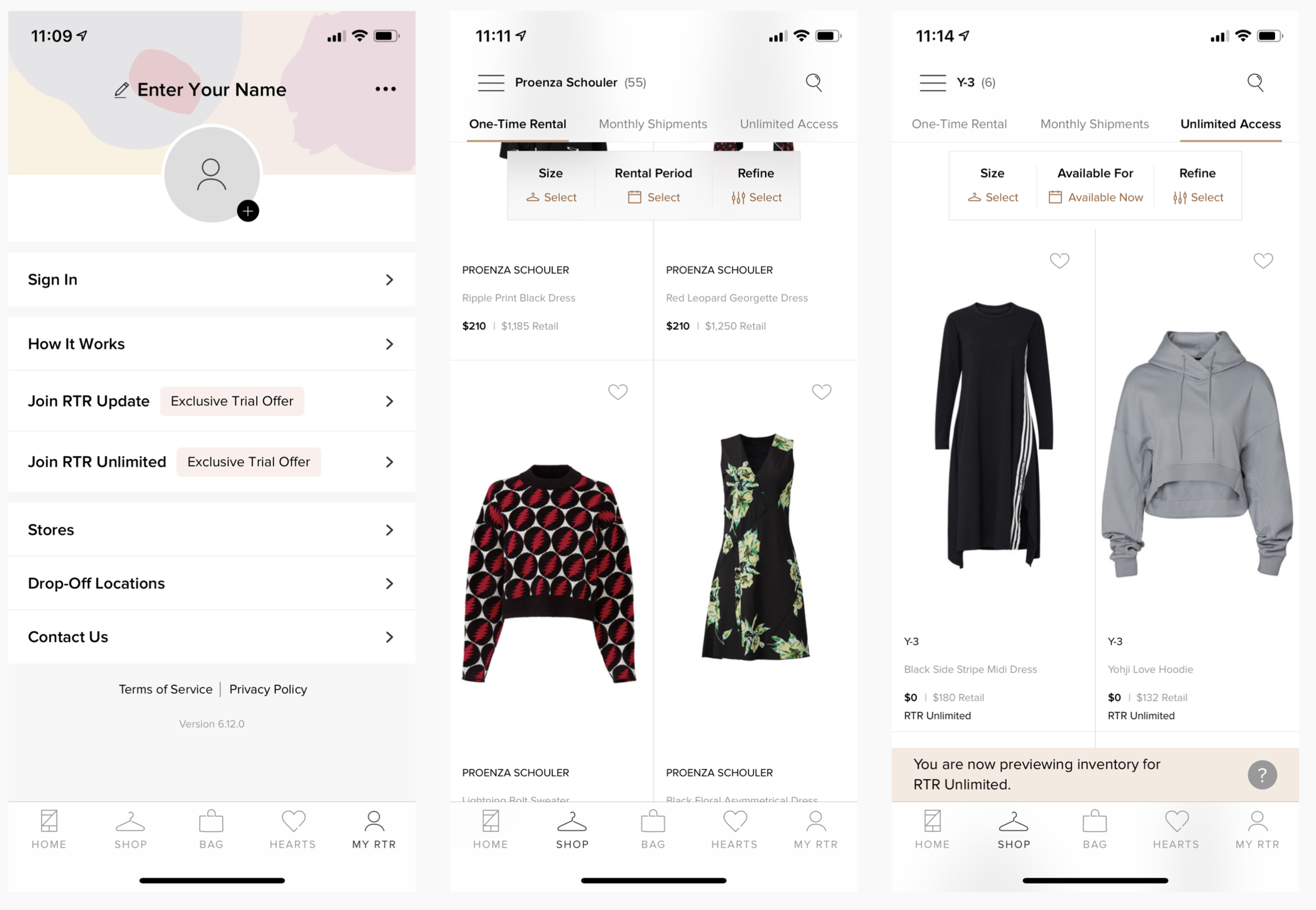
Once our users were subscribed, the app and web experience became and incredible, gated ‘drap and drop’ experience where they could digitally manage their closet. A part that particularly challenged me, however, was creating a high-value, enticing experience for the anonymous (not signed-in) user, until we get them over the line.
Shown is the anonymous My Account page, plus the PLP browsing experience, that simplifies a complex barrier to entry - entering your clothing size and rental date/period - down to an engaging, floating toolbar.
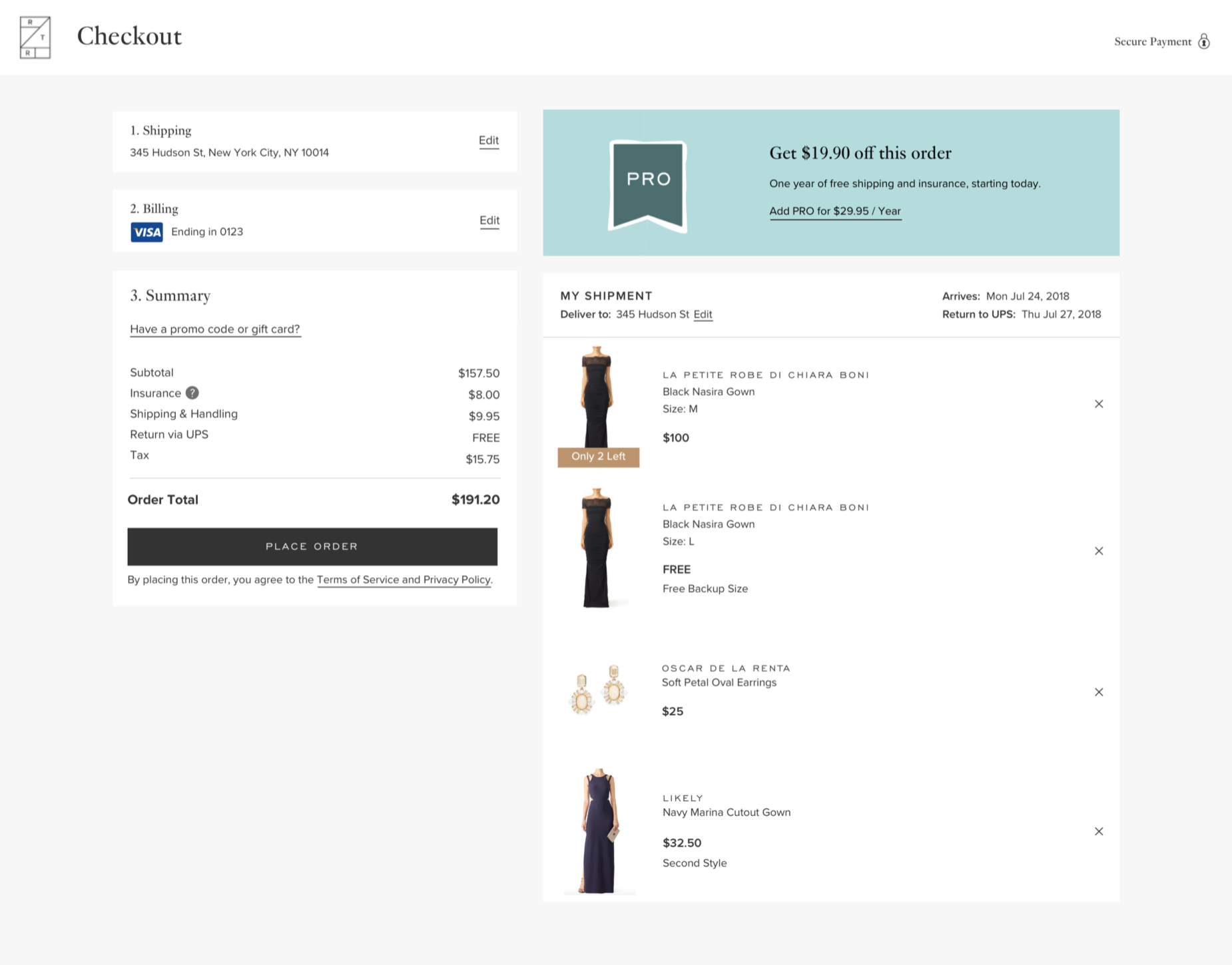
Redesigning the checkout for such a complex product offering was a mammoth undertaking, and I single-handedly owned the UX & design for both web and app.
Hundreds of mocks, tens of flows and handfuls of microinteractions were delivered after an incredibly thorough process of competitor awareness, team brainstorming, holistic thinking and strategic design.
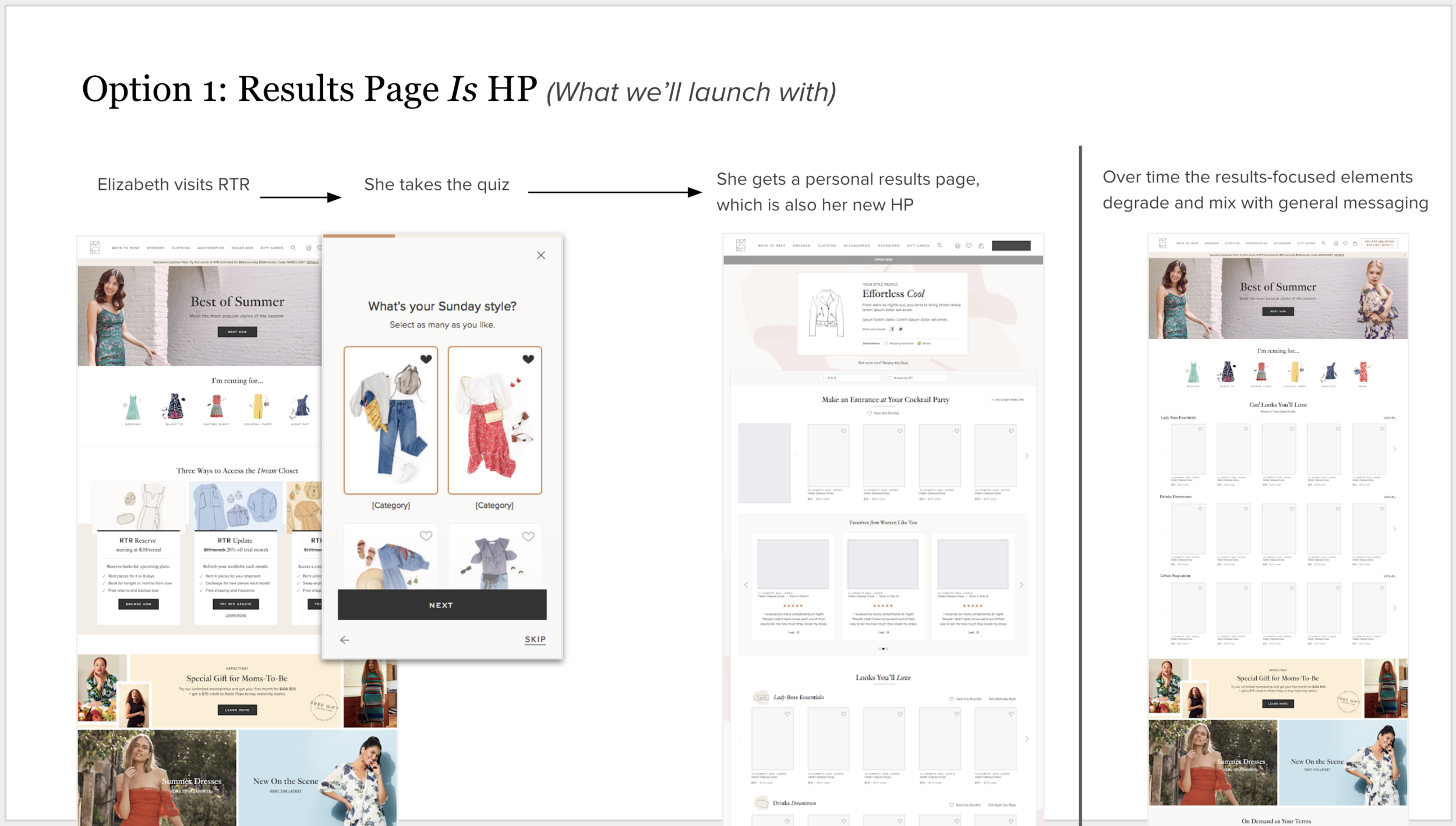
When time permits, I liked to do rapid learning phases of competitor analysis, customer interviews, guerilla prototyping and roadmap due diligence to prep for design, then propose strategic and holistic design plans that will inform the initial designing.
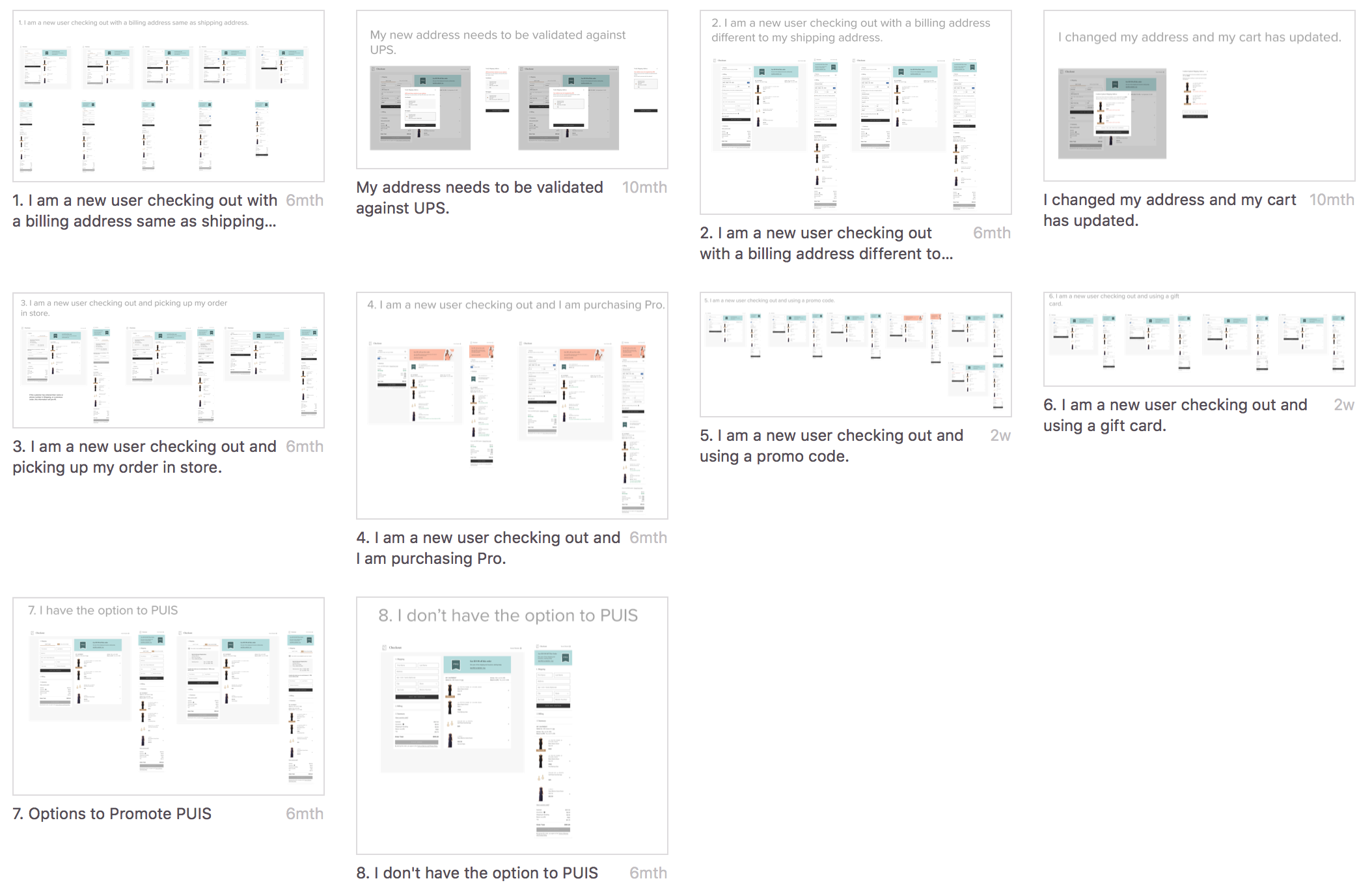
I always step designs out into flows to ensure all use cases are accounted for and explained.
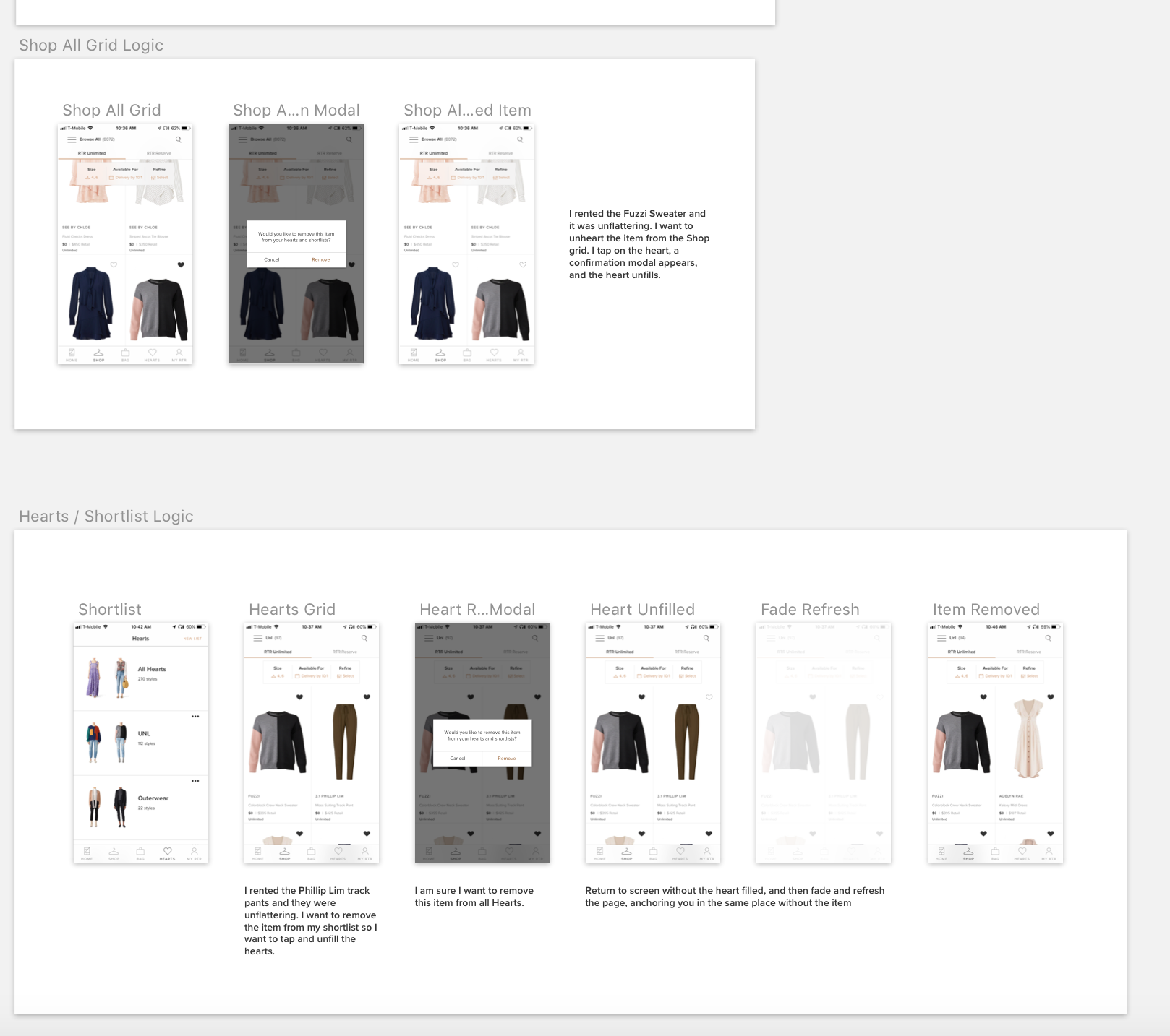
RTR is the most complex product I’ve ever worked on, and as a senior UX designer, the best way to manage design needs and work with developers was to constantly and thoroughly annotate the logic and functionality of the experience design.
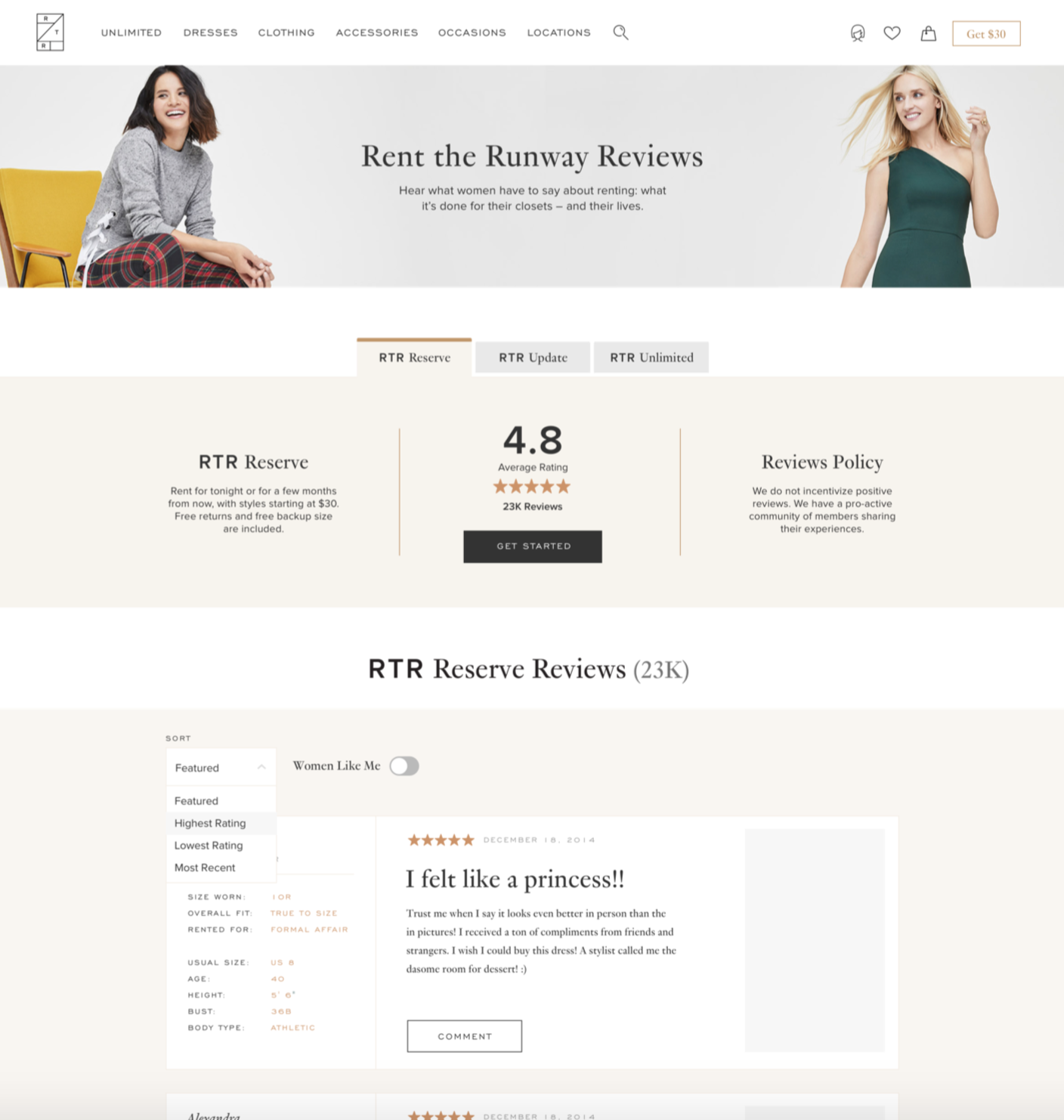
While usually working on the platform offering of RTR, sometimes I was engaged to work with the Product Marketing team on content-based pages for web and app that would have a large, positive impact for RTR.
The Reviews hub is an example of this, made to leverage our successful SEO techniques and respond to the high number of search enquiries for ‘RTR Reviews’.
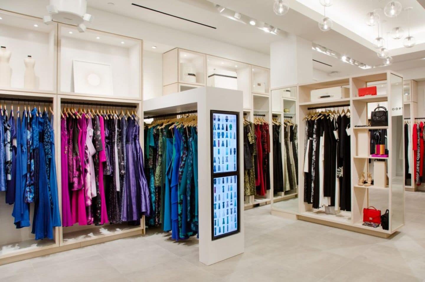
I used my service design background to map seamless customer experiences that start online with a subscription and continue in the brick and mortar spaces.
A store visit is a personable, high-tech experience - customers can sign in on arrival with the QR code in their app, drop their returned clothes, reserve a change room and browse the store while a stylist begins tailoring their change room experience for them.


It’s been immensely rewarding shipping designs for such a unique and disruptive ecommerce offering. In one and a half years at RTR, we shipped a huge amount of my design work as part of the relaunch of RTR’s subscription offering, as well as the ongoing support of RTR’s already successful Reserve program.
I was brought on at RTR to build out the subscription business, and a big challenge was converting all our old legacy ‘rental’ customers to a subscription.
The subscriptions were complex products with lots of rules that needed explaining, therefore a lot of time went into designing flows that were as simple and appealing as possible.
I worked on a lot of ‘special features’ in the app, that utilized newer technology is create tools we knew customers would love. Shown here is the location dropoff map, that had a lot of logic dictating suggestions to the customer on where they could drop off their clothes, where they could pick up new clothes, etc etc.
Another ‘special feature’ was the chatbot, that we designed to be as ‘Apple’ as possible within our app.
Once our users were subscribed, the app and web experience became and incredible, gated ‘drap and drop’ experience where they could digitally manage their closet. A part that particularly challenged me, however, was creating a high-value, enticing experience for the anonymous (not signed-in) user, until we get them over the line.
Shown is the anonymous My Account page, plus the PLP browsing experience, that simplifies a complex barrier to entry - entering your clothing size and rental date/period - down to an engaging, floating toolbar.
Redesigning the checkout for such a complex product offering was a mammoth undertaking, and I single-handedly owned the UX & design for both web and app.
Hundreds of mocks, tens of flows and handfuls of microinteractions were delivered after an incredibly thorough process of competitor awareness, team brainstorming, holistic thinking and strategic design.
When time permits, I liked to do rapid learning phases of competitor analysis, customer interviews, guerilla prototyping and roadmap due diligence to prep for design, then propose strategic and holistic design plans that will inform the initial designing.
I always step designs out into flows to ensure all use cases are accounted for and explained.
RTR is the most complex product I’ve ever worked on, and as a senior UX designer, the best way to manage design needs and work with developers was to constantly and thoroughly annotate the logic and functionality of the experience design.
While usually working on the platform offering of RTR, sometimes I was engaged to work with the Product Marketing team on content-based pages for web and app that would have a large, positive impact for RTR.
The Reviews hub is an example of this, made to leverage our successful SEO techniques and respond to the high number of search enquiries for ‘RTR Reviews’.
I used my service design background to map seamless customer experiences that start online with a subscription and continue in the brick and mortar spaces.
A store visit is a personable, high-tech experience - customers can sign in on arrival with the QR code in their app, drop their returned clothes, reserve a change room and browse the store while a stylist begins tailoring their change room experience for them.
